


What’s In A Book Cover
 Covers, covers, covers. What’s in a book cover, particularly in this day and technological age when covers are likely thumbnail digital images? Apparently they still matter to the extend that publishers are re-releasing books with revamped covers.
 Just recently Spec Faith carried the news announcement that Enclave Publishing has given the first two books in Morgan Bussey’s fantasy trilogy, Sons of Truth, new covers. Then this weekend Ashlee Willis contacted me about the new cover for her fantasy, The Word Changers. She now has an entirely different (and very gorgeous) cover—a sharp contrast, in my opinion, to the original.
 But I hardly consider myself a good judge. My reading developed in an era that didn’t put a lot into book covers. Take, for example, the covers on my copies of The Lord Of The Rings trilogy—rather plain. Consequently, I went for most of my reading life not really looking at covers and certainly not judging whether or not I wanted to read a book based on its cover.
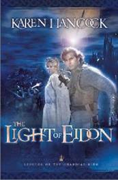 When I started writing full time, I had the opportunity to talk to other writers who told me how much they paid attention to covers. I thought it was simply a matter of preference until I heard feedback on Karen Hancock’s first book in her Guardian-King tetralogy, The Light Of Eidon. In fact, the feedback might have been on the first three books. At any rate, this group of readers/bloggers (part of a tour, as I recall) agreed that the covers had dissuaded them from reading the books sooner, that they appeared to be more like romance covers than fantasy covers, and therefore didn’t appeal, especially to male readers (even though the protagonist is a man).
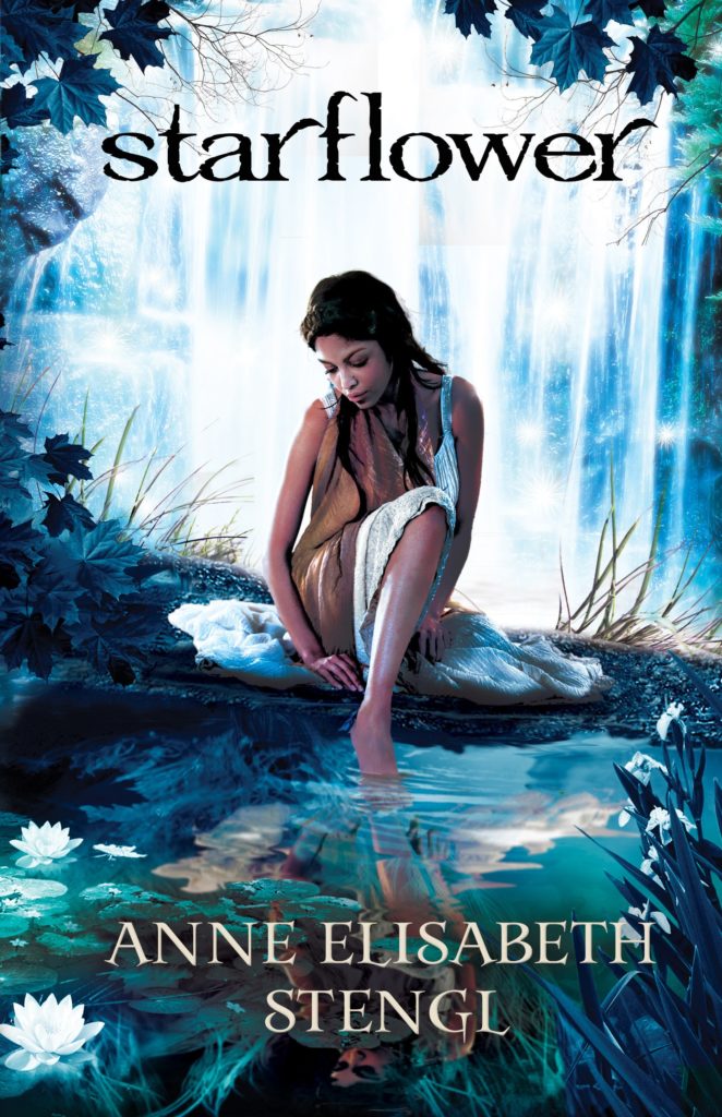
I heard similar feedback about Anne Elisabeth Stengl’s first six books in the Tales Of Goldstone Wood series. Of course, her protagonists are most often women, but men figure prominently in the stories. And although there might be romance in some, they are by no means romance stories. They are solidly and irrevocably fantasies.
Clearly some readers are making reading decisions based on covers. I’ll admit, I’ve started taking more notice of them. I don’t have a practiced eye, but I generally can spot what appears to be a cover created by an amateur. I don’t know enough about the process of designing them to know why one looks professional and the other looks like a low-budget production, but I do know the cover influences my expectations of the book.
On the other hand, I can think of several books that received great covers from their publishers. I mean, great! I ordered one from a bookstore, and when I went to pick it up, the clerk gasped. Actually gasped. Then said, I didn’t know there were any Christian fantasies.
The sad thing is, the stories didn’t always match the great covers. Some were too predictable or the characters weren’t well drawn. Some opened too slowly and didn’t hook readers enough to keep reading. In those instances, the gorgeous covers caught readers attention and many bought the books. But they didn’t buy the next one or the next, even though the covers were equally well done, because the story let them down.
All that to say, covers are important, but they can’t make up for a deficient story. They are like first contact. If it goes well there will be a return visit and perhaps a cultural exchange, then a treaty and eventually admission into the Federation.
Covers are also like job applications. If they communicate what the reader is looking for, then a back-cover-copy interview is in order, then perhaps a chapter-preview second interview, resulting in “hiring” the book. Sitting down to read it is like job-probation. As long as it’s fulfilling expectations, readers will keep going, but if there’s any loafing on the job, there might be a second chance, but probably not a third. That book will get its shiny, well-designed cover sat down on the shelf, never to see the light of day again.
So what are your thoughts about book covers? What makes them particularly enticing to you? Do you think Christian publishers are purposefully trying to make their speculative covers more appealing to women? Do men read fantasy even if the cover seems slanted toward women?
If you’re interested, Steve Laube is running a poll today on book covers


When I first started going to conferences waaaay back in 1997, this is what I learned: if a buyer likes the title, they’ll pull the book off the shelf and look at the cover. Then, if they like the cover, they’ll turn it over and read the back cover copy. If that interests them, they’ll open up to the first chapter. If the first page grabs them, they’ll probably buy the book.
I’m a wine lover, and I have my favorites, but I have to admit I sometimes buy a bottle based on the label. Just did that today. Some of those labels are works of art! And I make wine bottle lights, so wine labels are important to me.
And why do you think cook books have pictures? I know that doesn’t constitute cover art, but pictures show the finished product.
So, yes, book covers are incredibly important. Man looks on the outward appearance, right? And that’s not just with people. We read with our eyes first (no pun intended). We drink wine first with our eyes. We eat first with our eyes. But like Becky said, if the story doesn’t deliver, that will reflect in reviews. Then it won’t matter how wonderful the cover is.
I think book covers are extremely important. A low-quality book might have a fantastic cover – and so the reader may avoid sequels expecting the same quality contents – but they still picked it up that first time, often directly because of the cover. If a fantastic book has a horrible cover, then it will be missing out by many who are never drawn to even read the premise. For one, a low quality cover is going to imply low-quality contents regardless of what’s actually inside.
The same goes for covers that target too specific a demographic when the contents might appeal to a wider audience. I’m curious if publishers seem to target women more because they assume women buy/read more or if they are catering to an untrue stereotype.
Though I have seen examples of the opposite occurring, too. Books I might enjoy but a cover that scares me off, implying too much violence, or just something I wouldn’t want my daughter or husband to see. And if it’s something my family who knows me might misunderstand, what do I expect from the secular world who sees the cover.
I’ve worried that my cover for The Word Changers would appeal too largely to girls. I have a son and am very conscious about books appealing to both girls and boys. However, the protagonist of my book is a girl and I realize the story itself will naturally appeal to girls in general.
But … I went to a book event at a public school this past week and was amazed at the number of teen boys who not only showed interest in, but purchased, my book. One of them even came up to me about 10 minutes after buying it to inform me he had read the first chapter and was loving it! That was so awesome for me to hear.
My next books will feature a male protagonist, therefore I have much different plans for the covers. I am targeting boys for sure on these…! 🙂
Call me shallow, but I thought the guy on the original cover looked like a goober. Or that slightly stoned, driver’s license look, like he’d been waiting in the DMV for the last forty minutes and the counter person finally said standheretakeoffyourglasseslookatthecamera.
Totally agree that covers are important because of the message they send. In fact when I was reading “The Light Of Eidon” on a plane flight, I actually taped plain paper over the book’s cover since it looked to me so much like a somewhat trashy romance novel, and that was going to give completely the wrong impression to the people around me. Sad, since I appreciate that series so much…
Considering it’s probably a 75-25% split of female to male readers anyways, they’d gain more than they’d lose. I think though the reason why there are so many girl in dress covers is that it’s expensive, time consuming, and hard to get good illustrations for an indie author or small press, but relatively cheap to shoot a girl in a dress and put her on a photoshopped or stock footage background.
This isn’t about cover art, it’s about a different aesthetic: the *feel* of the cover. Most paperbacks have a shiny, slick feel. Some, however, have a more textured, suede-like feel that “reads” dirty to my fingers. Almost feel like I need a damp cloth to wipe them off – and this is with a brand new book! How many buyers might be put off subliminally by that feel and not buy the book? Anybody else have thoughts on this aspect?
With the rise of ebooks, I would think aesthetic feel should be less and less of a concern. While there are books that may be less pleasing to the touch, often the judgement is passed from a glance, before the book is handled physically.
If I’m picking up a book by an author I’ve never read before, a really good cover will catch my eye, as will a good title. In the case of urban fantasies, a cover will sometimes tell me I don’t want to read the book.
I agree, covers are really important! I’ve bought a book with a gorgeous cover, only to find the contents were less than polished. It’s rare for me to go the other way, though, because a low-budget cover does seem to advertise a low-quality story. Maybe that’s not fair, but it’s the impression I get . . . and enough books have proven me right that I hesitate to put money into a bad-cover novel.
Not an expert on what makes a cover look professional either, but cheap fonts and bad Photoshop jobs are usually a turnoff.
I, for one, didn’t see much of a problem with the Guardian-King covers. And I adore Anne Elisabeth Stengl’s! They do seem to appeal mostly to girls, though, and I wish more males would give them a chance.
I don’t pay too much attention to covers, though if the cover looks like it was drawn by a toddler using Microsoft Paint, then I’m probably not going to read the book. 🙂
I totally agree that covers are important. Very important. I would be much more inclined to pick up Ashlee’s book with the new cover than with the old. I know, it’s not fair! But it’s so true. I have a really hard time purchasing a book if the cover is cheesy, amateurish, photoshopped, etc. Even when I KNOW the writing is good! I just can’t stand it!
All of which to say I have some angst about possible covers for my own book. If I have to go the self-published route because no publishers will take it I’ll have to face this…I have thought a lot about the cover, and how to get a good one on a limited budget. But it’s one of the things I’m willing to splurge a little on.
Anything that looks like paranormal romance (girl in dress, shadows) will turn me right off.
Great conversation. With Ashlee I was wondering if her knew cover, which I think is beautiful, will mostly draw women readers. After I gasped and oohhed and ahhed a bit, I then thought, oh, but the male character isn’t in the picture any more.
David F, thanks for validating my point about Karen Hancock’s books. I was still in my “don’t notice the cover” phase, but once how “romance-y” they look, I realized how that could keep guys from even picking the books up. The ironic thing is that the female character on the cover of The Light Of Eidon, is Abramm’s sister.
And I’ll admit, like the rest of you a cover that looks low budget dissuades me from buying a book for the reason you mentioned—if the cover looks cheap, can the writing be better? I have a writer friend whose first self-published book I only just recently purchased because I didn’t think the cover was particularly attractive. And as you said, Lisa, I knew my friend is a good writer!
Tracy, I don’t think there’s anything wrong with Anne Elisabeth Stengl’s covers. I just think they largely give the message, This is a book for women. I’m not a guy so I can’t say, but I think the fantasy is so awesome, that the world is so imaginative, I’d think guys would enjoy the books too. And it’s not like there aren’t important male characters. Very important male characters! But I don’t know that the covers would tell men that.
As far as the feel of book covers, Kathy, I prefer the ones that feel . . . textured, maybe a little like leather. But I agree with sparksofember, as digital reading becomes more prevalent, texture of cover (and paper) will be less and less important. I will say that the covers I don’t like are the ones that are so thick they aren’t pliable and that nearly cut my skin as I hold them. I’ve had a number of POD books with covers like that.
And yes, covers can be turnoffs. I read some writing article recently, from a general market author. I considered subscribing to her site because I like what she said. Then I looked at her sidebar where there were pictures of her covers—almost all racy romance scenes with half-clothed people. I decided not to subscribe! Ha! So I guess I take the cake as the shallow one here.
Becky
I well remember The Light of Eidon cover controversy, back when I was reviewing. Bethany House took strong notice of it, to their credit, and at the time, actually sent me several proposed covers for the second book to get my opinion as a fantasy fiction lover.
I am absolutely in love with the Tales of Goldstone Wood. While I think the covers are gorgeous in and of themselves, I have found myself repeatedly telling male readers to ignore the covers and enjoy the beautiful stories that celebrate both genders and their distinctive desires and quirks.
It’s funny about The Light of Eidon being such a hotspot. I first saw it at the local library a few years ago while looking for Aurthurian fiction for my husband and never once thought it was a romance – in fact, I took note of it immediately because it looked like something I thought he would enjoy. (Now book #3 – Shadow Over Kiriath – that looks like a romance!)
Another thing I appreciate about Stengl’s covers is that they’re all unified. The latter ones aren’t published by the same company as the first, but the covers all still match. I have a few other book-posters, but Stengl’s novels are ones I would have framed if I could.